Emotional Website Design: Why a Beautiful Site Wins Customers
Bruno Vieira · Updated July 2026
Introduction
As a business owner, you have probably asked yourself whether it is really worth investing in a beautiful website, or whether something simple and 'good enough' will do the job.
Here is the truth, backed by research: people judge your website in about 50 milliseconds, and that first impression is emotional before it is rational. In a blink, visitors decide whether they trust you, usually without knowing why.
This is where emotional website design comes in. In plain language, this article explains why a beautiful, emotionally designed site matters for your business, and how it turns curious visitors into paying customers.
What is Emotional Website Design?
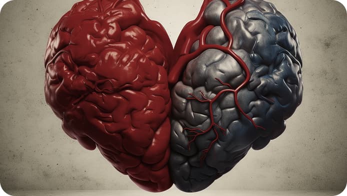
Emotional website design is the practice of shaping a site's visuals, motion and words to trigger a specific feeling, such as trust, delight or desire, in the first seconds, so visitors stay and convert.
A beautiful site is the starting point, but emotional design goes further: it makes the potential customer feel something the moment they land on your page. That feeling is what makes them stay, read, and buy, instead of clicking back to Google.
Donald Norman, one of the leading scholars on the subject, explains in his book 'Emotional Design: Why We Love (or Hate) Everyday Things' how design can attract or repel a user long before they read a single word. If you are still weighing whether your business even needs a strong site, our guide on whether you need a website is a good starting point.
Why Emotion Matters for Your Bottom Line
Why is emotion so important in web and app design? Because people do not decide with logic alone. Neuroscience shows emotion comes first and reason follows, so the feeling your page creates in the first seconds shapes whether a visitor stays, trusts, and buys.
The stakes are measurable, and the research is clear:
50 milliseconds: the time it takes users to form a first impression of your site (Lindgaard et al., 2006). You do not get a second chance at it.
94%: the share of first impressions that are design-related rather than content-related (research from Northumbria and Sheffield universities).
75%: of users admit they judge a company's credibility based on its website design alone (Stanford Web Credibility research, B.J. Fogg).
In plain terms: an emotionally designed website lowers bounce rate, keeps people reading, and builds the trust that turns visitors into customers. Two companies can offer the exact same service, but the one whose site makes people feel confident and cared for is the one that wins the deal. Emotional design is not decoration. It is a business tool that moves conversion, loyalty and word of mouth.
The Three Levels of Emotional Design, Translated into Business Outcomes
Donald Norman describes three levels of emotional response. Here is what each one actually means for your sales.
It is not enough that we build products that function, that are understandable and usable. We also need to build products that bring joy and excitement, pleasure and fun, and yes, beauty to people's lives.
Visceral (the 50-millisecond verdict): the gut reaction to colors, imagery and shape. This is the split second that decides whether a visitor stays or bounces. A travel site full of paradise beaches wins this level instantly.
Behavioral (do they finish the form?): the pleasure of actually using the site. Smooth transitions, instant feedback and effortless flows are what carry a visitor all the way to your contact form or checkout instead of giving up halfway.
Reflective (do they remember and refer you?): the lasting impression tied to your brand and reputation. This is why people feel proud to unbox an iPhone, and why a memorable site gets recommended long after the visit.
Win all three and a website stops being a brochure and becomes a salesperson that works while you sleep.
Practical Tips for Emotional Website Design
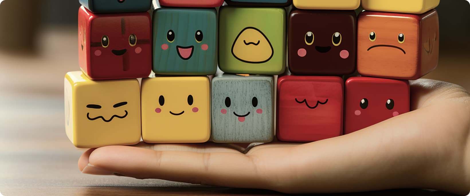
Colors: Use palettes that carry the emotion you want. Warm colors like red and orange signal energy, while cool colors like blue and green signal calm and trust.
Images: Choose photos and illustrations with real emotional appeal. Genuine human faces almost always outperform generic stock.
Typography: Rounded fonts feel friendlier; serif fonts feel established and trustworthy. Pick the feeling on purpose.
Language: Write like a person, not a brochure. Positive, plain, conversational copy lowers the guard of a busy buyer.
Layout: Guide the eye with clear hierarchy so the visitor always knows where to look and what to do next.
Motion: Subtle microinteractions and smooth animation add life and signal quality, as long as they never get in the way of the content.
Sound: Use it sparingly and never on autoplay. For most business sites, unexpected audio costs you more conversions than it earns.
Emotional Website Design Examples
Looking for emotional design examples you can learn from? Some of the most successful digital products in the world are, at their core, exercises in emotional website design.
Airbnb uses warm photography, human stories and welcoming language to make you feel you belong before you book anything. Visceral and reflective design working together.
Duolingo turns a tedious task, learning a language, into a playful, rewarding game with characters, streaks and celebratory microinteractions. Behavioral emotional design at its best.
Spotify Wrapped takes your own data and hands it back as a personal, shareable story that makes you feel seen. A masterclass in reflective design.
Apple keeps its product pages spacious, calm and cinematic, so the emotion of premium quality is felt before a single spec is read.
The lesson from every example is the same: emotion is designed on purpose, never left to chance.
How We Apply Emotional Design at WB
We practice what we preach. Our own site opens with an interactive 3D scene precisely because the visceral level is where trust is won or lost in the first second.
On real projects the principle carries the whole experience. For Revalida Italia, a medical-exam preparation platform we built, we used interactive 3D anatomy environments and smooth motion to turn dry study material into something students genuinely enjoy coming back to. That is behavioral and reflective design doing the heavy lifting: people stay longer, finish more, and remember the product.
Emotional design, done right, is not about decoration on top of a finished site. It is a decision made at every layer, from the first color to the last microinteraction.
Frequently Asked Questions
What is emotional website design? In short, it means designing every part of a site, from color and imagery to motion and wording, so a visitor feels a deliberate emotion instead of nothing at all. The goal is a page people connect with and act on, not just one that works.
Why is emotion important in web and app design? Because buying decisions are driven by emotion first and justified by logic later. A site that makes people feel confident in the first seconds keeps them from bouncing and moves them toward contacting or buying.
Does emotional design actually increase conversions? Yes. Since users judge credibility largely on design (75%, per Stanford research) and form an impression in about 50 milliseconds, a site that wins that emotional verdict lowers bounce rate and lifts conversion for the same traffic.
What is the difference between emotional UI design and emotional website design? Emotional UI design focuses on the feeling of individual interface elements and interactions (buttons, transitions, feedback), while emotional website design applies the same intent across the whole site, from the hero to the copy to the checkout.
What are examples of emotional website design? Airbnb (belonging), Duolingo (playful reward), Spotify Wrapped (personal story) and Apple (calm premium feel) are all built on emotional design.
Conclusion
Emotional website design is not a nice-to-have. It is the difference between a visitor who bounces in three seconds and one who trusts you enough to buy.
In a world saturated with information, emotion decides how people interact with your brand and whether they choose you over an identical competitor. A customer may forget what you said, but they will never forget how your site made them feel.
At WB Digital Solutions we build websites with interactive 3D and motion that turn that first 50-millisecond impression into trust, and trust into leads. Tell us about your project and we will show you what an emotional site could do for yours.
Did this help you?
Share it with someone who could use it too.